GovTech / Security & Compliance SaaS for Defense Contractors, 2024–2025
ISI Defense: Leading v5.0 through complex permissioning
Sole designer on v5.0 of a security platform for defense contractors. Owned the design system and the clearance-based permissioning logic under it, working directly with the engineering team.
ISI Defense builds a cloud-based SaaS security and compliance platform for defense contractors, storing sensitive security information and surfacing it through dashboards and reporting. I came on as the sole UI/UX designer on the team, working directly alongside developers and product managers to design v5.0 of the platform, an API-driven, React-based application where every screen had to map cleanly onto real data and real clearance rules, not just onto a Figma frame.
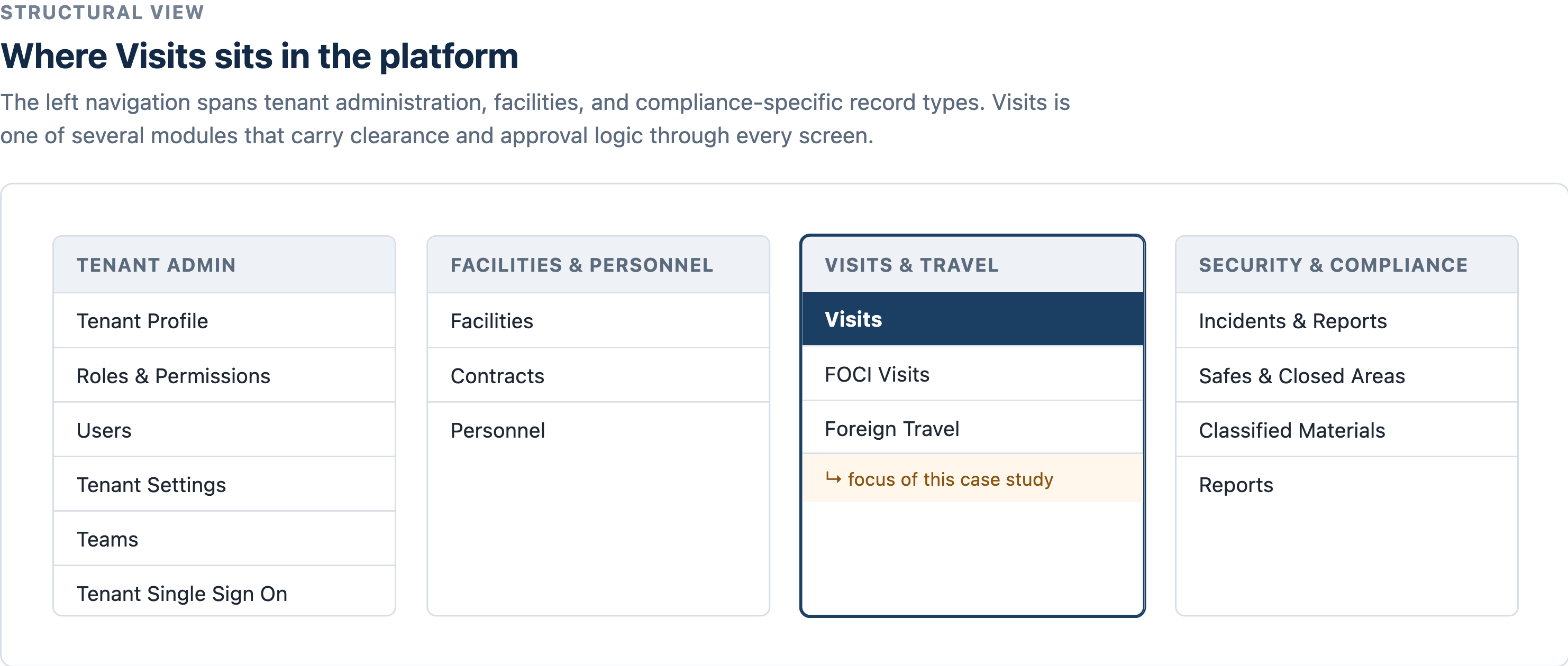
Visits was where I spent most of my time, but the patterns I built there needed to generalize across every one of those clusters.
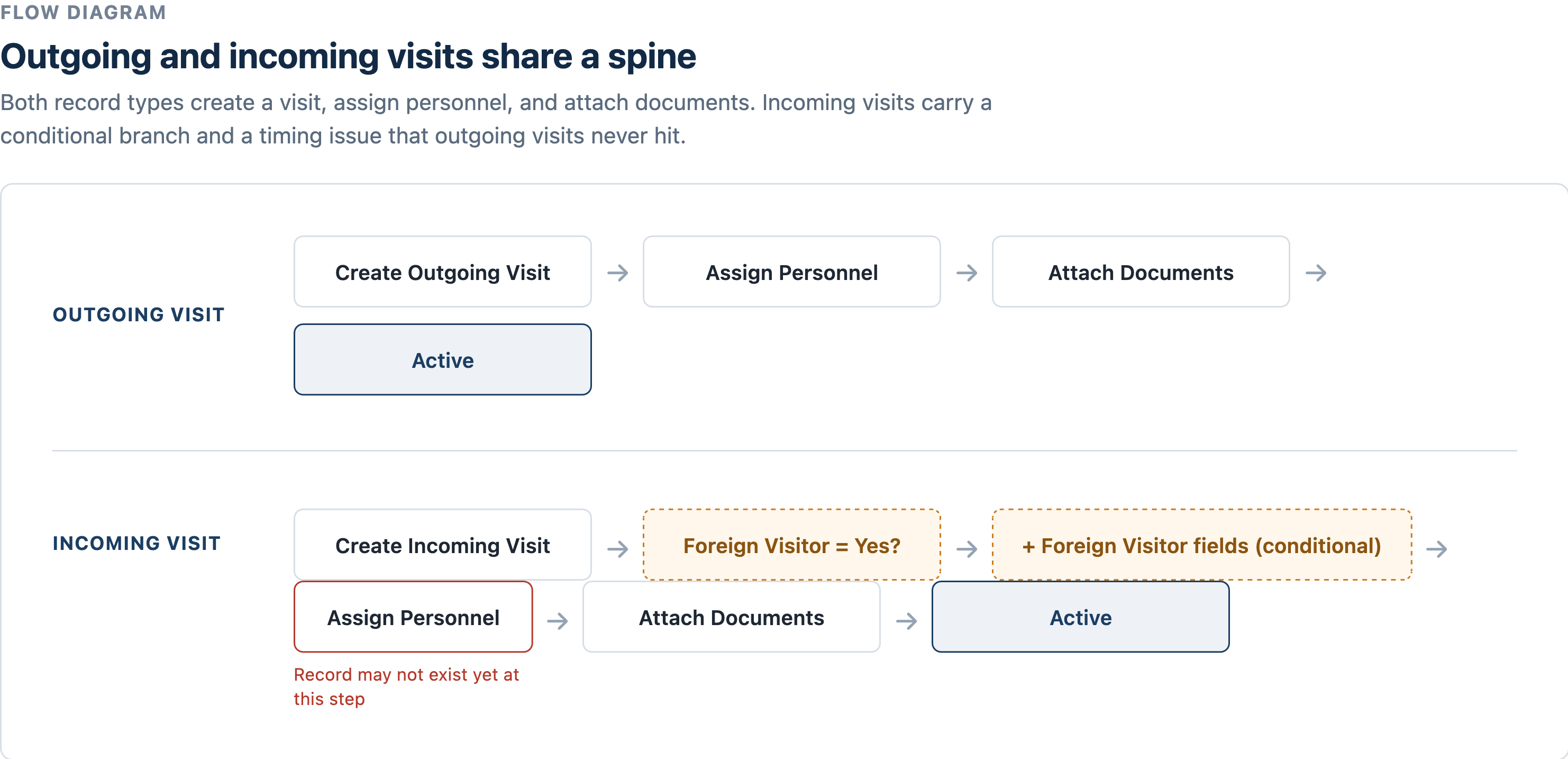
Those steps had to hold up on real screens, not just in a diagram, which meant the interface itself had to carry the same logic: what a user could see and do had to track their clearance and the record's state at every point in that flow.
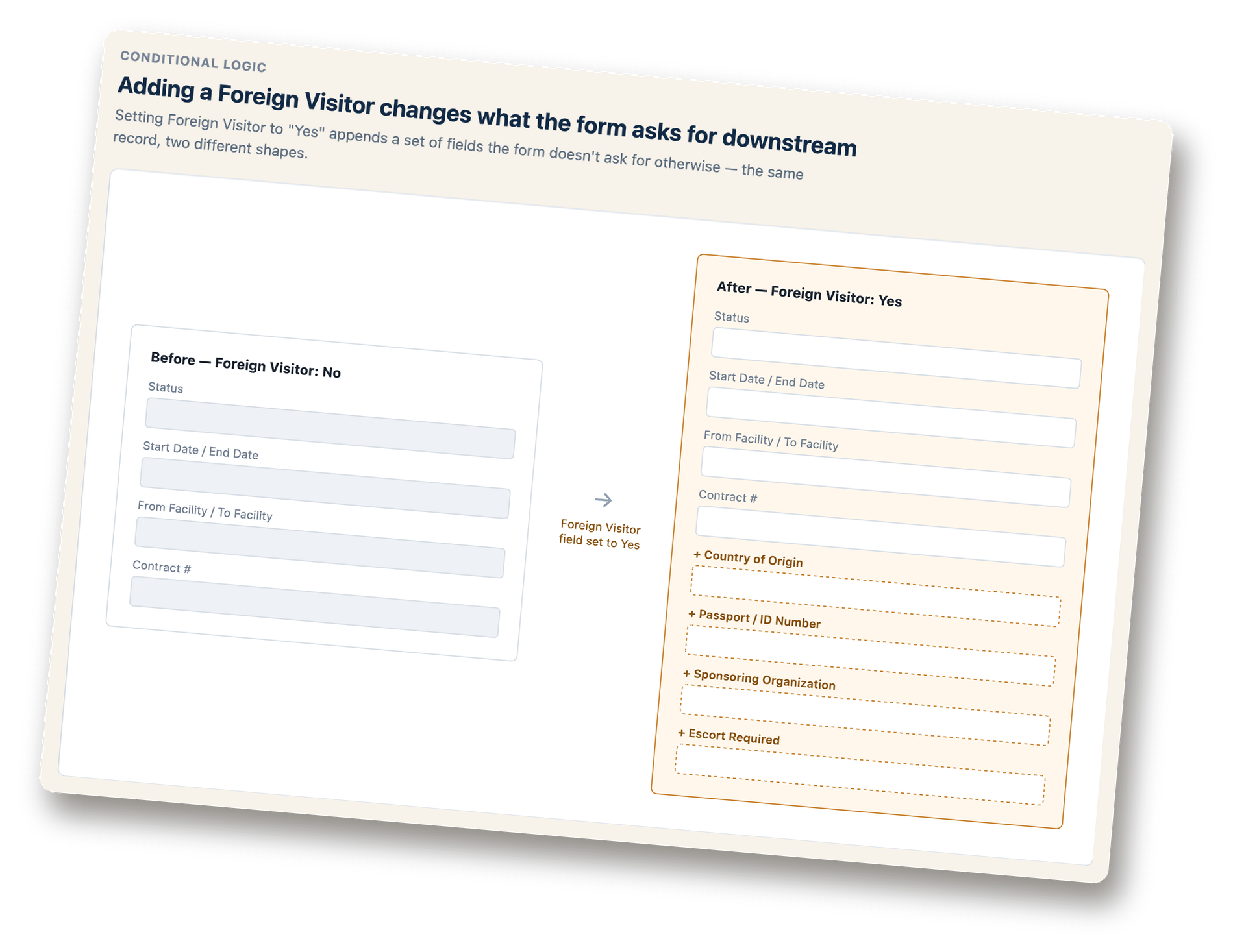
The clearance rules got more interesting wherever a record could change shape mid-workflow. Foreign Visitor was the clearest example, shown in the diagram at the top of this page: setting it to Yes appended four fields the form didn't ask for otherwise, the same record, two different shapes, and the platform needed to validate against whichever shape was active.
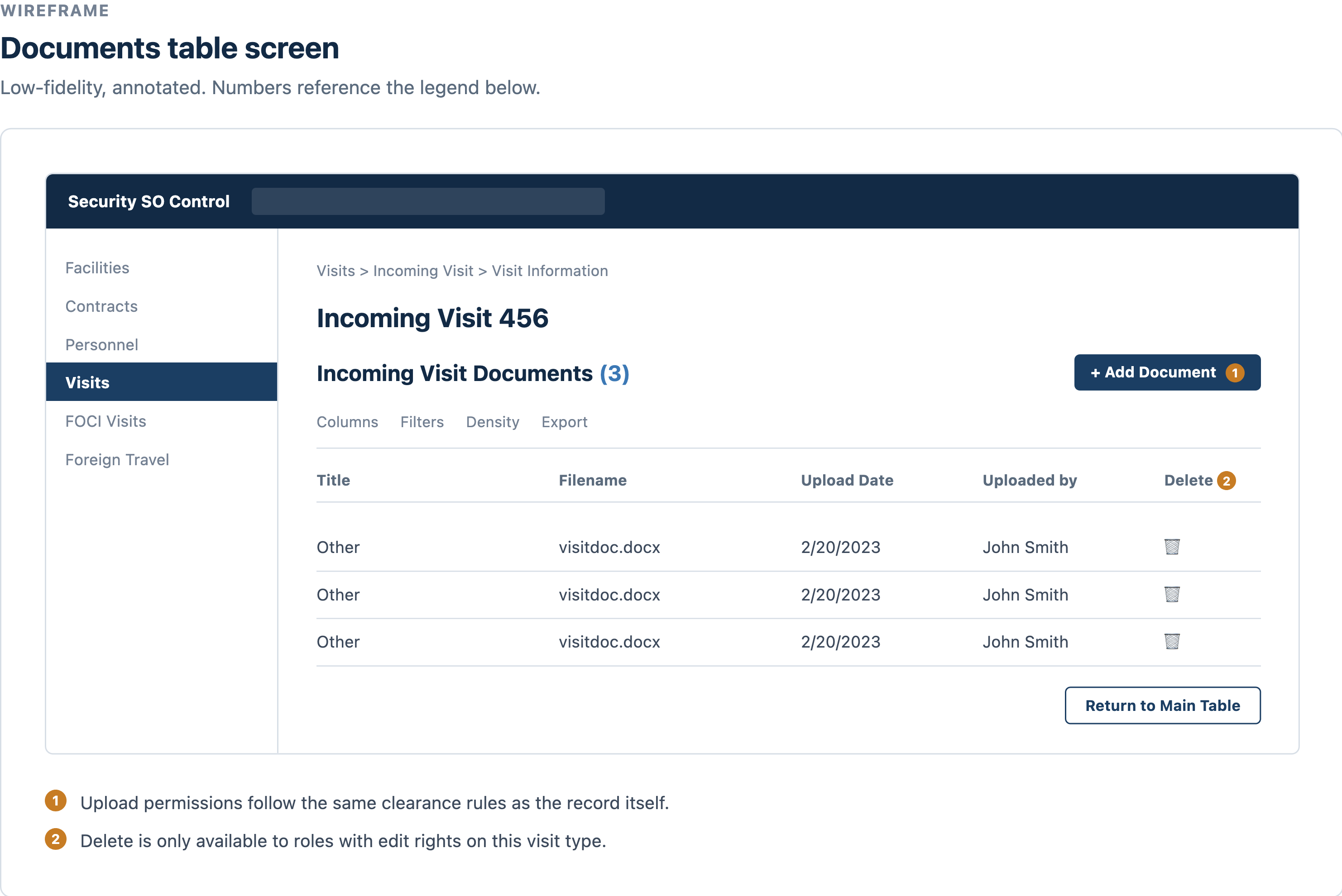
Because the application was so API-driven, design couldn't get too far ahead of the data. I worked through workflow logic in low-fidelity wireframes directly with the engineering team before moving into high-fidelity Figma designs, once we'd agreed on what states actually existed on the backend. Being the only designer on a team of developers also meant I was the one setting the design vocabulary: the patterns for how dashboards, reporting views, and permissioning states got built consistently as the platform grew, since no one else on the team was going to do that if I didn't.
Accessibility was another layer on top of all of this, not a separate workstream. Because ISI Defense's clients are federal agencies and defense contractors, the platform had to meet Section 508 of the Rehabilitation Act, which is now aligned with WCAG 2.1/2.2 AA, the actual technical standard 508 points to. The 21st Century IDEA Act added a third layer on top of that, pushing federal-facing software to be modern, mobile-friendly, and consistent, not just technically compliant. Every pattern I designed, from clearance-gated fields to workflow states, had to hold up against all three at once.
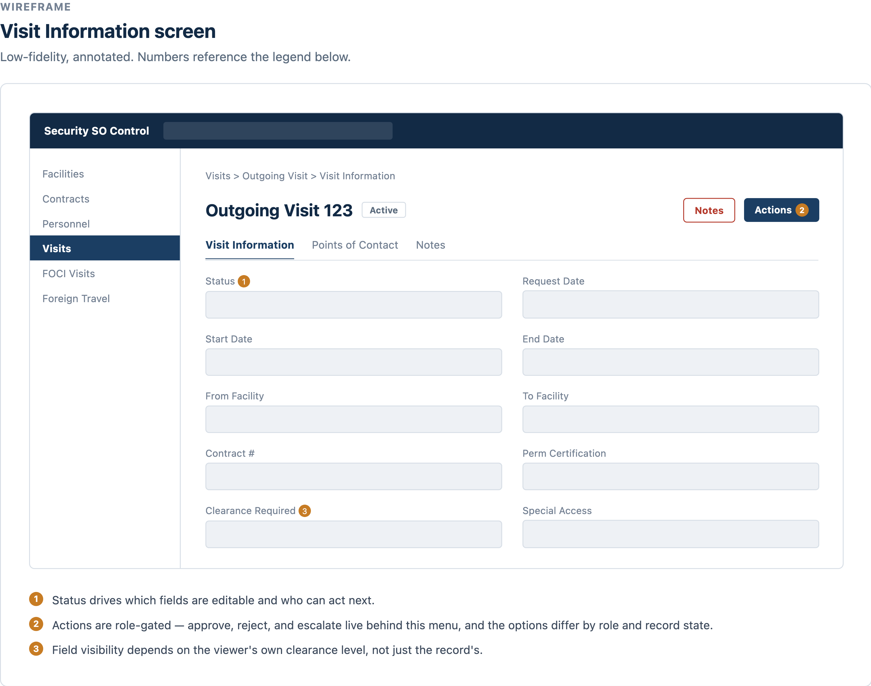
This is also, in effect, a role-based access control (RBAC) problem: every screen had to enforce least privilege, showing a user only what their clearance and role actually permitted, no more. The clearance-gated fields and role-gated actions in Visits map directly onto what a SOC 2 auditor would call a control, and v5.0 needed to support real access reviews, not just enforce permissions in the moment, but make them auditable. Documenting that mapping clearly enough for both engineers and non-technical stakeholders to trust it is a skill that generalizes well beyond this one platform.
What I learned
As the only designer on a team of engineers, the deliverable was never really the wireframes, it was a shared vocabulary the team could keep building on when I wasn't in the room. That reframed how I thought about my own output: a screen was only finished once a developer could look at it and know exactly what state produced it, without asking me.
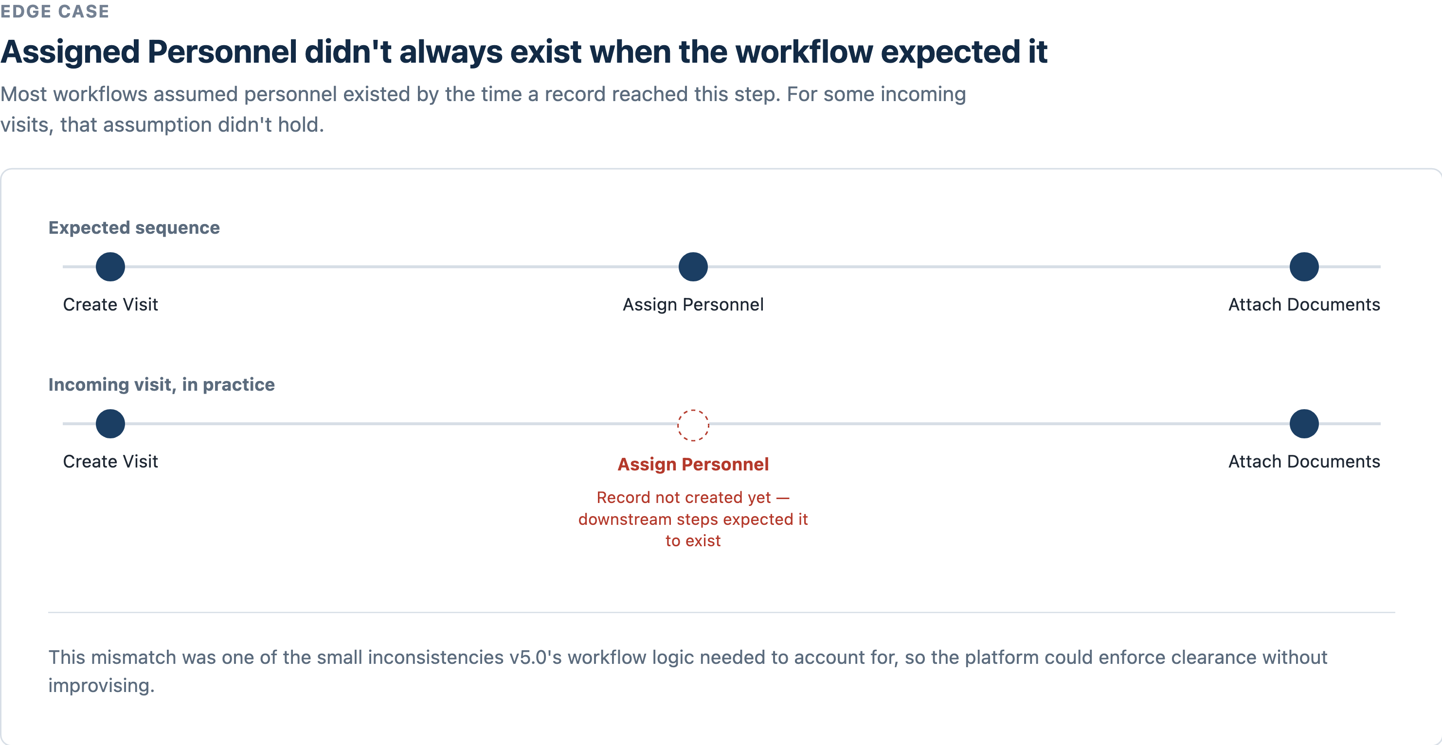
I also came away thinking differently about edge cases. It would have been easy to treat the Foreign Visitor branch or the Assigned Personnel timing gap as exceptions to design around later. But in a compliance product, the exception is often the whole point, the case where getting it wrong actually matters. Designing the happy path first and patching the edge cases in afterward isn't an option when the edge case is a security requirement. I now start every complex workflow by asking what breaks the assumed sequence, not what the ideal sequence looks like.
This is the kind of engagement that defines UXcalibur's approach: owning the relationship end to end, from scoping through delivery, so the client has one person who understands both the interface and the compliance context it has to hold up under. That's increasingly what compliance-adjacent clients need: someone who can translate a technical permission model into language an auditor, a customer's security team, or a new hire can actually trust.