Design System & Motion / Sidestep, a free design system for learning products, 2026
Sidestep: a design system where motion is a first-class token
Sidestep is a free design system for learning products, built so AI coding tools can use it, with motion specified as strictly as color: named roles, four personalities, and a written motion spec for every component.
Sidestep is a design system for learning products: quiz apps, courses, language practice, training. It ships as React components, CSS tokens, a Figma library, and a mascot built in Rive, and it's free under the MIT license. What makes it different is where it puts its effort. Most design systems specify color down to the hex value and leave motion as a line in the guidelines. Sidestep treats motion as seriously as color, and it's built for the way interfaces are increasingly made: by AI coding tools working from a design system.
Why motion, and why now
AI coding tools now build interfaces straight from design systems. They read the tokens and components and use them, which means they're only as consistent as what the system writes down. Color, type, and spacing are written down almost everywhere. Motion almost never is: when I looked at a survey of AI support across 21 open-source design systems, it sorted that support into eleven categories, and none of them was motion. Even the emerging DESIGN.md format, a file meant to describe a system to an AI, has no place for it. Its own linter rejected Sidestep's motion section as an unrecognized key.
So when an agent adds an animation, it makes one up. A 300 ms ease-out here, a 0.2 s spring there, every screen a little different. A designer would catch that in review. An agent shipping ten screens an hour won't. Motion is the part of an interface that gets least attention in a handoff, and it's exactly the part an AI has the least to go on. That's the gap Sidestep is built for.
Motion as roles, not values
Colors in a good system have roles: you don't pick green, you pick "primary action." Sidestep does the same for movement. There are eight motion roles, named for what's happening rather than how it looks: feedback (someone pressed something), enter, exit, state change, navigation, attention, celebration, and sequence. Each one carries a duration, an easing curve, a spring, a travel distance, and a scale. A component never says "animate for 200 ms." It says "this is feedback," and the system decides what feedback feels like.
Every component has a written motion spec beside its code: a table of which role it uses in which state, and what happens when someone has asked their device for less motion. The specs are where the judgment lives. A lost streak is never animated for attention; only a gain is celebrated. Typing gets no motion at all. A plain card never moves; only a card that does something gives feedback. Only the first six items of a list are staggered, so a long list never keeps anyone waiting. Knowing where motion doesn't belong is most of the job.
One setting, four personalities
Because components only name roles, the roles can be remapped all at once. Sidestep has four personalities. Calm fades things in place: nothing travels and a wrong answer doesn't shake. Snappy uses short, straight moves with no bounce. Playful grows things in, overshoots its springs, and makes celebrations big. Reduced is for people who ask their device for less motion, and it's applied automatically. A product picks one with a single attribute, and every component follows.
My first pass got this wrong. The three personalities used the same moves at slightly different sizes: an enter traveled 4, 4, or 12 pixels, and on a phone you couldn't tell them apart. The retune made them differ in kind, not degree, and I added a check to the build that measures every role in every personality and fails if any two become too alike. The springs have a rule too: routine motion has to settle within half a second. The first bouncy spring took more than a second to come to rest, so every spring was retuned, and the playful one now overshoots by about a quarter and settles in 475 ms. All of it is plain CSS reading the tokens, springs included. There's no animation library in the components at all.
A mascot is a component too
Learning apps live on feedback, and the strongest feedback a learning product has is a character reacting to you. So the mascot is a component, with the same inputs as everything else. Hubert is a hermit crab with five states that map to five moments in a lesson: idle, thinking, correct, incorrect, and celebrate. He takes the theme's colors and the motion personality like a button does, so a calm product gets a calmer Hubert, and under reduced motion every reaction still reads through his pose alone.

He's built in Rive, rigged and animated from a traced vector drawing: six independently moving legs on a tripod walk, claws on bones, blinking at uneven intervals, and eyes on stalks that look around on their own with a slight lag between them, which is what keeps him from feeling mechanical. The whole Rive file is generated from a script and checked frame by frame, so changing him is a rebuild rather than an afternoon of hand-editing.
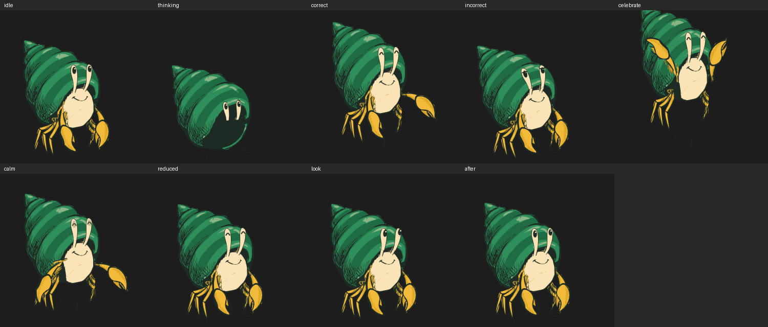
Hubert is the default, not a requirement. The component defines a contract, the five states, the look inputs, the colors, and the motion energy, and any character built to it drops into the same place with no app code changes. Custom mascots are part of what I offer around the system.
Does it work with an AI?
Sidestep ships with the files that teach a coding agent how to use it: a skill, rule files for Claude Code and Cursor, a DESIGN.md, and a reference for every token and motion spec, all generated from the same source as the code so they can't drift. Then I tested it. Two fresh agents got the same request, to build a quiz screen, in two projects that differed only in whether Sidestep was installed.
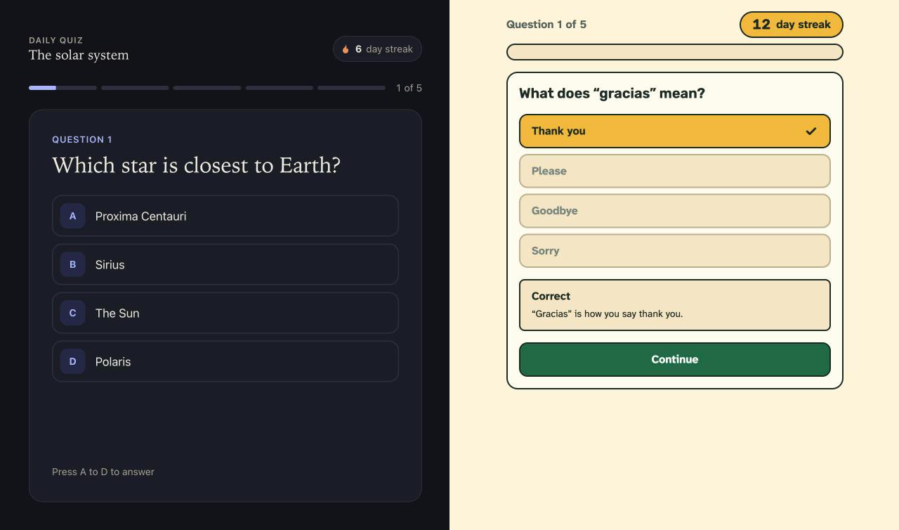
Without Sidestep, the agent wrote 1,146 lines and invented 117 colors, durations, easing curves, and font sizes. With it, the agent wrote 340 lines and invented none. A second test, a settings screen, came out the same way: 1,232 lines and 125 invented values against 442 and none. What I didn't expect was what the agent did with motion. Nobody asked it to, but it chose a named role for each animation it added, wrote its own motion spec table, and hid the progress bar on the finished screen so only one thing celebrated at a time. When it wanted the screen to advance on a timer, it swapped in a Continue button instead, because a timer would have needed a duration it wasn't allowed to make up.
To be honest about what that proves: it was one run per side, and the scoring counts exactly what Sidestep forbids, so it measures consistency with the system, not quality. The screens built without Sidestep were more elaborate, not worse. The tests also worked in the other direction. The agent found a real bug, a text field wider than its card that my own demo pages had hidden, and a rule that was too strict. Both were fixed. An agent using a system honestly turns out to be a good way to find its faults.
Made to be changed
A system nobody can make their own is a template. On the Try your brand page, a visitor picks a color, typefaces, corners, and a motion personality, and a real lesson takes them on immediately. Behind it, Sidestep builds a full color ramp from the brand color and uses the exact color wherever it's readable. Where it isn't, it picks the nearest step that passes and says so, in a sentence. A yellow brand becomes a highlight with dark text on it, and buttons use a darker step. Every pairing is checked for contrast in both day and night.
The Figma library mirrors the code: color, spacing, shape, and motion variables, with the four personalities as modes, so a designer can hand off motion by name, the same way they hand off color. Then the docs site, which is itself built from Sidestep: every page is made of its own components and moves by its own rules.
A whole app, built only from Sidestep
A design system proves itself in a product, so I built one: Rule of Thumb, a small design tutor that teaches the rules of thumb behind good interfaces by letting you feel them first. Five lessons, each an experiment, then a question, then a takeaway. In Target size you tap tiny targets scattered to the edges, then big ones close together, and the app times both. In Response time you press Save four times, with four different waits, and say which felt instant. Hubert is the guide: he thinks while you answer, reacts when you do, and on the longest wait in Response time he starts thinking too, which is itself part of the lesson.
I held the app to the same rules an AI agent gets: components first, one primary button per screen, one celebration at a time, nothing that loops, and no colors, timings, or sizes of its own. Then I ran the same checker I used in the agent tests on its code. It found no invented colors, durations, easing curves, fonts, shadows, or loops, and twelve of Sidestep's components in use. Two lessons break the rules on purpose, because breaking them is the lesson: the first round of Target size uses targets a third of the minimum tap size, and Response time makes you wait. The How things arrive lesson doesn't fake its motion either. Of the three cards it compares, two are Sidestep's own snappy and playful personalities.
Building it found problems the docs never would have. The lesson progress bar filled the moment you answered, and a full bar celebrates, so it celebrated beside the answer's own reaction: two celebrations at once, against the system's own rule. And my first version of the Grouping lesson didn't work. With each label above its box, convention gives the answer away whatever the spacing, so there was nothing to feel. Putting each label under its box, evenly spaced, makes it genuinely ambiguous until the grouped version fixes it with nothing but space.
What I'd tell another designer
For years, motion was the part of the spec you described in a meeting and hoped survived the build. AI makes that worse, because the build no longer passes through a person who might remember the meeting. It also makes it fixable. An agent follows written rules more faithfully than any of us. If motion is named, scoped, and written down, it ships the way you meant it, on every screen, every time. That's the bet behind Sidestep: in the age of AI, the design system is the designer's voice in the room, and motion needs to be in it.