Fintech / Small Business Lending, 2025
Fora Financial: A leaner template for product pages
A product page redesign concept for Fora Financial, a small business lending company, turning long-form educational pages into a modular, conversion-focused template built to repeat across every funding product they offer.
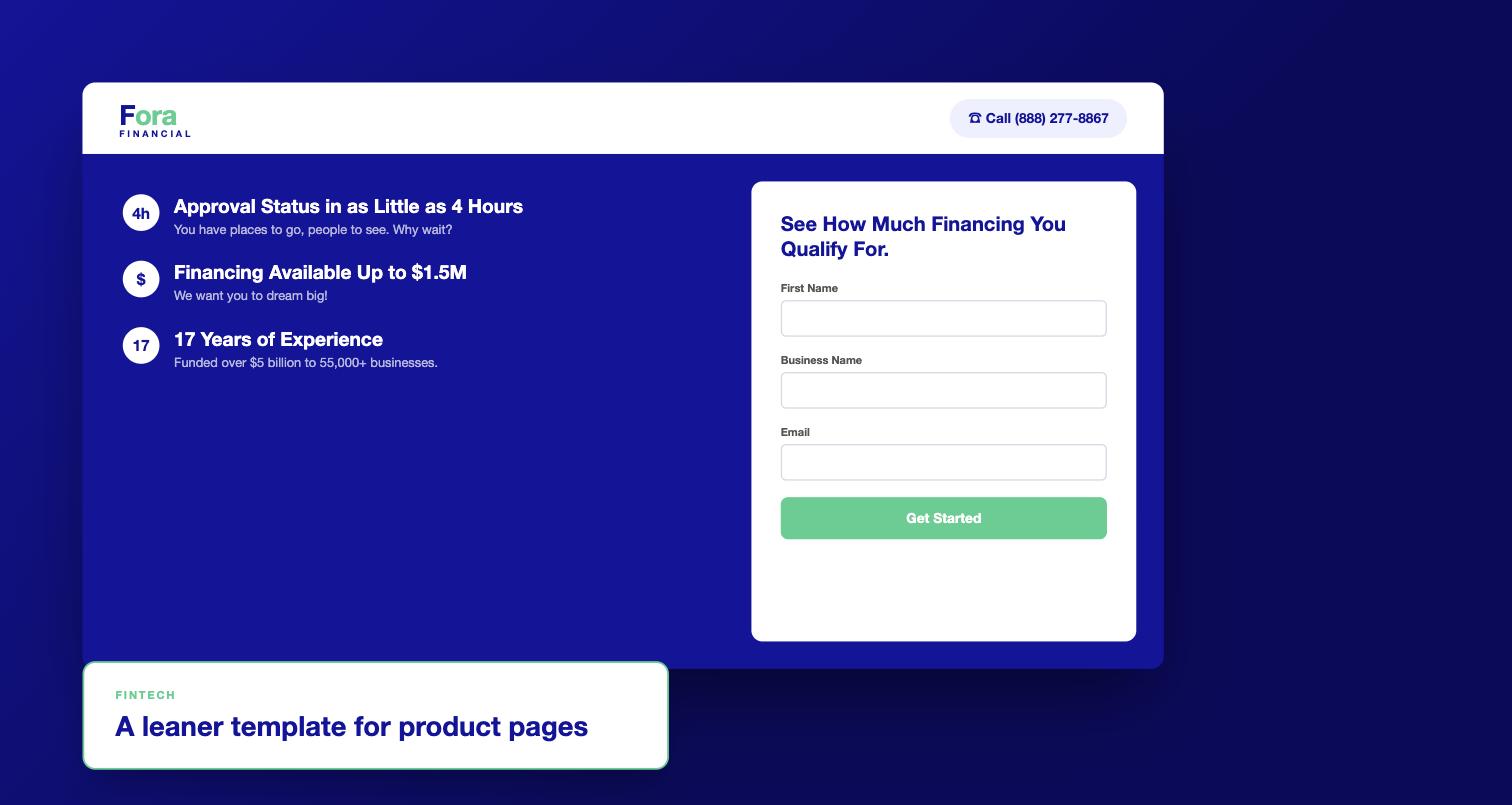
Fora Financial is a small business lending company, offering term loans, revenue advances, lines of credit, SBA loans, and invoice factoring. I was brought in to rethink how their product pages worked, using their Term Loan page as the pilot for a template meant to repeat across every funding product they sell.
The existing pages read like long-form educational guides, useful for SEO, but working against a visitor who arrived from a paid ad or a retargeting campaign already knowing roughly what they wanted. Dense paragraphs slowed people down right when they needed to compare options and apply.
A leaner template
The concept was built around a short list of goals: capture high-intent leads through a lightweight form, pre-qualify interest before it ever reached sales, simplify the decision itself, and stay modular enough to replicate across Fora's other products without a redesign every time. A few modules did most of the work. A Quick Stats bar surfaced loan amount, term, required documents, funding speed, and repayment style before a visitor had to read a word of body copy. An "Is this right for you?" checklist let people self-select out of a product early instead of discovering it wasn't a fit three paragraphs in. An inline micro-form asked for just funding amount, urgency, and contact info, not a full application, and a simple Apply, Match, Funded sequence replaced a wall of explanation.
For visitors who were comparing more than one product, I designed an optional comparison block, term loan against small business loan, side by side on loan amount, payment schedule, funding time, requirements, and what each one was actually best for, with a direct line to a person if they still weren't sure.
Every design note came back to the same instinct: keep it scannable, bulleted, one to two sentences at most. The whole point of the template was to respect a visitor's time when they'd already shown up ready to act, not to re-educate them from scratch.